React Awesome Button: Animated Button Tutorial & Setup
React Awesome Button: Animated Button Tutorial & Setup
Short answer: react-awesome-button is a lightweight React component library that provides ready-made animated buttons. Install via npm/yarn, import styles, and use the AwesomeButton component — then customize sizes, colors, and animations or add your own CSS for production-ready interactive buttons.
Tip: if you want a concise guide and examples, check the hands-on react-awesome-button tutorial.
Installation & Getting started
Getting up and running with react-awesome-button takes under a minute. The package ships as a standard npm module; after install you must import the compiled stylesheet so the animations and base styles render correctly. This makes it trivial to drop animated buttons into existing React apps without configuring additional build steps.
Run one of the commands below, then import the component and CSS at the top of your React file. If you prefer CDN builds or SSR setups, you can adapt accordingly, but the npm/yarn flow is the most common for modern React apps.
npm install react-awesome-buttonyarn add react-awesome-button
Example usage after install:
import React from 'react';
import AwesomeButton from 'react-awesome-button';
import 'react-awesome-button/dist/styles.css';

export default function App() {
  return <AwesomeButton>Click me</AwesomeButton>;
}
If you want a step-by-step walkthrough with annotated examples, see this guide: react-awesome-button getting started.
Core API, Props and common states
The library centers on a single, composable button component. Most projects only need to know how to change type, size, and disabled/loading states; everything else is CSS-level customization or small wrappers. Treat the button as a presentational component — delegate business logic and async flows to your container components.
Key capabilities you'll use frequently are:
- Type variants (primary, secondary, etc.), sizing, and disabled states
- Hooking into click handlers and managing async operations outside the component
- Swapping content to indicate loading, success, or error
Pattern for a loading state — keep logic outside the button so the component stays reusable:
function SubmitButton() {
  const [loading, setLoading] = React.useState(false);

  async function handleClick() {
    setLoading(true);
    try {
      await submitForm();
    } finally {
      setLoading(false);
    }
  }

  return (
    <AwesomeButton disabled={loading} onPress={handleClick}>
      {loading ? 'Submitting...' : 'Submit'}
    </AwesomeButton>
  );
}
Animations, effects and customization
react-awesome-button comes with a set of built-in animations. You can rely on these for most use cases, then layer your brand styles on top. For bespoke motion or brand-specific patterns, override or extend the CSS. The component is CSS-driven, so you can add new keyframes, tweak easing, or change durations with plain CSS or preprocessor variables.
To customize without touching node_modules, create a small stylesheet that targets the component's class names or wrap the button to apply modifiers. Always support prefers-reduced-motion to respect user preferences — treat motion as an enhancement and provide a static alternative for those who opt out.
If you want concrete examples of customizing effects, timing, and responsive behavior, refer to a practical walkthrough: react-awesome-button tutorial. It shows how to override styles and add your own keyframes cleanly.
Examples & patterns for production
Use animated buttons in call-to-actions, form submit flows, or micro-interactions. Favor patterns where the UI reflects the async state: disabled during submit, shows progress or success, and recovers gracefully on error. Keep accessibility in mind — ensure focus states remain visible and keyboard users can trigger the same effects as pointer users.
For complex sequences (e.g., a button that triggers an animation then navigates), separate the animation trigger from the navigation. Let the button emit an event or return a promise that the parent handles; that leads to predictable routing and testable code.
Example: show a loading spinner, then a success checkmark, then navigate. Manage this in a parent component and only let the button handle presentation. That keeps the UI testable and avoids race conditions when unmounting components after navigation.
Performance, accessibility & testing
Animated elements can add paint and composite work. Keep animations GPU-friendly by animating transform and opacity rather than expensive layout properties. If you bundle many button variants, tree-shake styles when possible or lazy-load the stylesheet for low-impact pages.
Accessibility checklist: ensure role and aria attributes are correct, provide an aria-live region for status changes if your button triggers background work, and use aria-busy or aria-disabled when appropriate. Make sure focus order is preserved and custom animations don't trap focus.
For testing, snapshot visual output sparingly. Prefer interaction tests that assert the button calls handlers, disables during async ops, and restores state. Use jest/RTL to simulate keyboard activation for robust coverage.
Deployment tips & troubleshooting
Common issues include missing stylesheet import (buttons render unstyled), CSS specificity conflicts with your global resets, or broken animations when bundlers strip keyframes. If buttons look wrong after deployment, check that the stylesheet is loaded and that your build process didn't tree-shake required CSS.
Another frequent problem is reduced-motion users or performance constraints on low-powered devices. Detect prefers-reduced-motion and provide a non-animated alternative to ensure usability for all users.
If a particular animation behaves unexpectedly in production but works locally, compare build-time minification settings and validate you’re not accidentally overwriting class names or CSS variables during optimization. Also verify SSR hydration if you render server-side — ensure the initial static render matches the client to avoid layout jank.
FAQ
A: Install via npm or yarn, then import both the component and its stylesheet. Example: npm install react-awesome-button, then import 'react-awesome-button/dist/styles.css' and import AwesomeButton from 'react-awesome-button'.
Q: How can I customize animations and styling?
A: Override the library's CSS classes or append a wrapper with your own styles. Add keyframes and custom durations as needed, and always implement a prefers-reduced-motion fallback. For practical examples, the tutorial walks through style overrides and custom effects.
Q: What's the best pattern for showing a loading state?
A: Manage loading as React state in the parent/container component, disable the button during the async operation, swap the content for a spinner or message, and expose appropriate ARIA attributes like aria-busy or aria-disabled for assistive tech.
Semantic core (primary, secondary, clarifying clusters)
react-awesome-button, React animated button, react-awesome-button tutorial, react-awesome-button installation, react-awesome-button setup, react-awesome-button getting started
Secondary (medium intent):
React button component, React button library, React button animations, React button customization, React interactive button, React button states, react-awesome-button example
Clarifying / LSI terms (supporting):
animated CTA button, loading state button, custom button styles, button accessibility, prefers-reduced-motion, button performance, CSS keyframes button, import react-awesome-button, AwesomeButton usage

משלוח עם קוד מעקב, קיימת אפשרות למשלוח מהיר.

קניה מאובטחת בכרטיסי אשראי או פייפאל. והחזר כספי מלא אם המוצר פגום או לא כמו שהזמנתם.

שירות לקוחות לכל שאלה במייל, טלפון או וואטסאפ.

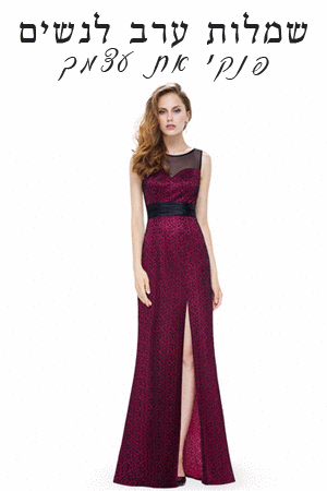
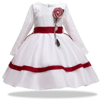
שמלות ערב לנשים – עכשיו גם אתם יכולות
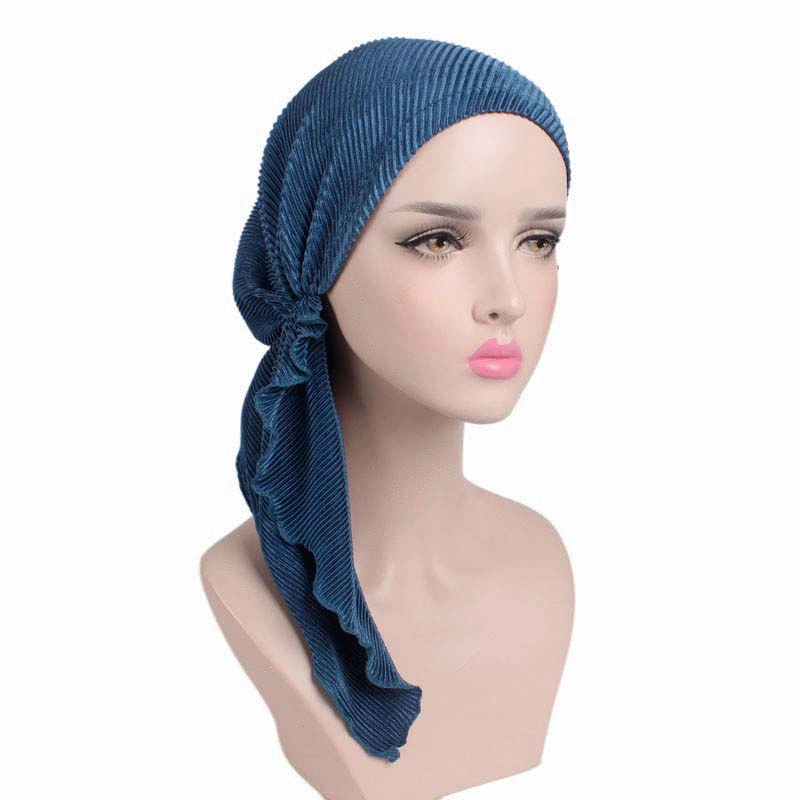
מבחר ענק של כיסויי ראש לנשים
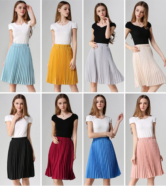
חצאיות לנערות
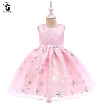
עוד שמלות לילדות
-
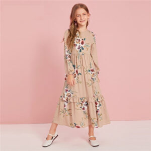
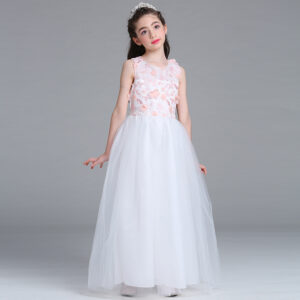
 שמלת נסיכת לילדות עם פתיתי שלג, בצבעים ורוד או תכלת, ללא שרוולים, מתאימה לכל אירוע
₪131.00 – ₪149.00
שמלת נסיכת לילדות עם פתיתי שלג, בצבעים ורוד או תכלת, ללא שרוולים, מתאימה לכל אירוע
₪131.00 – ₪149.00
-
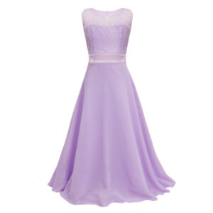 שמלת תחרה ארוכה לילדות
המחיר המקורי היה: ₪149.00.₪135.00המחיר הנוכחי הוא: ₪135.00.
שמלת תחרה ארוכה לילדות
המחיר המקורי היה: ₪149.00.₪135.00המחיר הנוכחי הוא: ₪135.00.
-
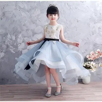
 שמלת קטיפה נצנצים לילדות ברמה גבוה, שרוול קצר בצבע שחור/ירוק וזהב אורך רצפה בעיצוב טקסטורה מטורף
₪440.00 – ₪522.00
שמלת קטיפה נצנצים לילדות ברמה גבוה, שרוול קצר בצבע שחור/ירוק וזהב אורך רצפה בעיצוב טקסטורה מטורף
₪440.00 – ₪522.00
-
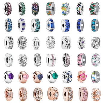 חרוזי צ'ארמס פנדורה 925 משובצים זרקונים מכסף S925, בצבעים מדליקים ומבריקים
המחיר המקורי היה: ₪80.00.₪29.99המחיר הנוכחי הוא: ₪29.99.
חרוזי צ'ארמס פנדורה 925 משובצים זרקונים מכסף S925, בצבעים מדליקים ומבריקים
המחיר המקורי היה: ₪80.00.₪29.99המחיר הנוכחי הוא: ₪29.99.
-
 שמלת שושבינה עם אפליקציות ותחרה ב 3 צבעים ללא שרוולים עיצוב ושלם ונקי בצבעים תכלת, ורוד או לבן - אורך ברך
המחיר המקורי היה: ₪317.00.₪159.00המחיר הנוכחי הוא: ₪159.00.
שמלת שושבינה עם אפליקציות ותחרה ב 3 צבעים ללא שרוולים עיצוב ושלם ונקי בצבעים תכלת, ורוד או לבן - אורך ברך
המחיר המקורי היה: ₪317.00.₪159.00המחיר הנוכחי הוא: ₪159.00.
-
 שמלת שושבינה מסטין, שמלת כדור עם שרוולים ארוכים מתחרה, גובה ברך, עם פרח ורוד משגע ופסי סטאן בצבע אדום או כחול
₪142.00 – ₪161.00
שמלת שושבינה מסטין, שמלת כדור עם שרוולים ארוכים מתחרה, גובה ברך, עם פרח ורוד משגע ופסי סטאן בצבע אדום או כחול
₪142.00 – ₪161.00
-
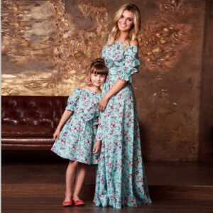 שמלות תאומות לאם ולבת, פרחוניות עם שרוולי מרפק פאף, סטרפלס ארוכה בצבע טורקיז עם פרחים ורודים וסגולים
₪90.00 – ₪128.00
שמלות תאומות לאם ולבת, פרחוניות עם שרוולי מרפק פאף, סטרפלס ארוכה בצבע טורקיז עם פרחים ורודים וסגולים
₪90.00 – ₪128.00
-
 שמלה לילדות אורך קרסול בצבע חאקי פרחונית, שמלת שכבות רוכסן אחורי שרוול ארוך
המחיר המקורי היה: ₪305.00.₪183.00המחיר הנוכחי הוא: ₪183.00.
שמלה לילדות אורך קרסול בצבע חאקי פרחונית, שמלת שכבות רוכסן אחורי שרוול ארוך
המחיר המקורי היה: ₪305.00.₪183.00המחיר הנוכחי הוא: ₪183.00.
-
 שמלת פאייטים נוצצת עם ירח וכוכבים, שרוול קצר אורך קרסול בצבעים לבן, מנטה וורוד
₪238.00 – ₪256.00
שמלת פאייטים נוצצת עם ירח וכוכבים, שרוול קצר אורך קרסול בצבעים לבן, מנטה וורוד
₪238.00 – ₪256.00
-
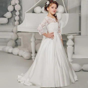 שמלת נשף מסטין מעוצבת לבנה לילדות, ארוכה וגולשת, תחרה בחלק העליון ושרוול ארוך - מושלמת
המחיר המקורי היה: ₪612.00.₪526.00המחיר הנוכחי הוא: ₪526.00.
שמלת נשף מסטין מעוצבת לבנה לילדות, ארוכה וגולשת, תחרה בחלק העליון ושרוול ארוך - מושלמת
המחיר המקורי היה: ₪612.00.₪526.00המחיר הנוכחי הוא: ₪526.00.
-
 שמלת ברך קלוש כתפיות לילדות, קיצית ומהממת בצבעים מדליקים
₪65.00 – ₪79.00
שמלת ברך קלוש כתפיות לילדות, קיצית ומהממת בצבעים מדליקים
₪65.00 – ₪79.00
-
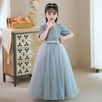
 שמלת שושבינה אלגנטית לילדות בצבע שמפניה עם נצנצים גובה ברך בעיצוב מיוחד משובצת אבנים ומה לא...
₪343.00
שמלת שושבינה אלגנטית לילדות בצבע שמפניה עם נצנצים גובה ברך בעיצוב מיוחד משובצת אבנים ומה לא...
₪343.00
-
 שמלת ערב אלגנטית לילדות עם תחרה וסטין אורך רצפה, שרוול 3/4, בעיצוב מיוחד, איכותית בשחור לבן או אדום
המחיר המקורי היה: ₪399.00.₪298.00המחיר הנוכחי הוא: ₪298.00.
שמלת ערב אלגנטית לילדות עם תחרה וסטין אורך רצפה, שרוול 3/4, בעיצוב מיוחד, איכותית בשחור לבן או אדום
המחיר המקורי היה: ₪399.00.₪298.00המחיר הנוכחי הוא: ₪298.00.
-
 שמלת ערב לילדות ארוכה עד הרצפה מאימה לאירועים מיוחדים במיוחד בשילוב רקמה ופרחים תלויים
₪112.00 – ₪127.00
שמלת ערב לילדות ארוכה עד הרצפה מאימה לאירועים מיוחדים במיוחד בשילוב רקמה ופרחים תלויים
₪112.00 – ₪127.00
-
 שמלת יום הולדת תכלת לילדות נפוחה ומקסימה עם תחרה ורשת מהסרטים, שילוב של ספנדקס ופוליאסטר ללא שרוולים
₪348.00 – ₪364.00
שמלת יום הולדת תכלת לילדות נפוחה ומקסימה עם תחרה ורשת מהסרטים, שילוב של ספנדקס ופוליאסטר ללא שרוולים
₪348.00 – ₪364.00